Hi everyone,
I had something else planned for today originally, but while writing the post, I noticed that I didn't have all the polish names/numbers at hand and decided to put it on hold until I have found those polishes in my stash..... Yeah, the collection got so big now that I sometimes have trouble finding a polish that's not from one of the major brands.
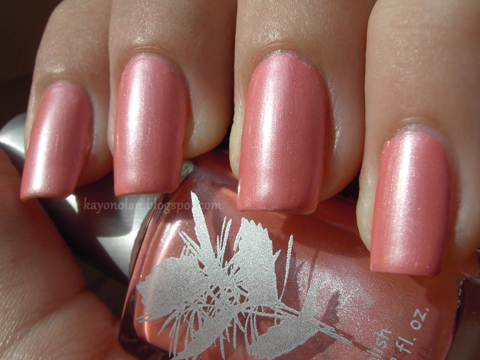
So anyway, I still have a lot of swatches in my 'ready' folder. Why not finally post one more of them? The following swatch of Susan Azalea by Priti NYC is no less than 18 months old. Honestly, after all this time, I can't really say much about it characteristics anymore, but I still kind of like the pictures. (My cuticles are so healthy-looking...)
Same as with French Affair by essie, I'm not a hundred percent sure if I can pull this kind of color of. I really like this kind of color though, so I'll probably wear them anyway.
Susan Azalea has this really pretty silver shimmer running through that makes it a bit special for me. The shimmer was one of the reasons why I bought it and I remember that I saw some swatches for this polish back in 2012 that didn't mention that shimmer... Really confused me, since it's one of the major characteristics, in my opinion.
Seeing the pictures makes me want to wear it again. It's the perfect season right now, but I would feel so bad... there's soooo many untrieds right in front of me. I really need to change my buying habits... °-°;
I wish Priti NYC weren't so expensive. I really like their formula and the colors are really pretty too. So whenever I see some at TKMaxx or the like, I'm grabbing some...
Do you like Priti NYC? Any colors to recommend?
Posts mit dem Label swatch werden angezeigt. Alle Posts anzeigen
Freitag, 4. April 2014
Mittwoch, 12. Juni 2013
H+M - Grey
Hallöchen~
Today, I have another swatch for you, a swatch I'm dedicating to the Lacke in Farbe... und bunt! collaborative once again. The color for this week is taupe... not really my color. But that's exactly why I have so many untrieds that belong in this category. So I got to kill a total of three untrieds, but I'm only going to show you two in this post.
Heute habe ich wieder einen einfachen Swatch für euch, den ich, wie letzte Woche, der Lacke in Farbe... und bunt! Aktion widme. Die Farbe diese Woche ist Taupe... nicht so wirklich meins. Aber genau deshalb habe ich so viele ungetragene Lacke in diesem Farbspektrum. Alles in allem, habe ich drei ungetragene in getragene Lacke verwandeln können~ Aber in diesem Post soll es nur um zwei gehen.
Anyway, the polish I chose is another H&M polish. This one is called... Grey. It's also from a minis set, but a different one from last week's. This one really is a mini. The bottle holds only 3.2 ml! I would never have called this shade grey. It's no grey! To me this is a light taupe. My camera is displaying it a tiny bit too violet though. It's a bit more brown than violett. I'm wearing two coats here. The first is really really sheer, but the second made it opaque on my nails. There's a light silver shimmer running through this polish, but it's not as obvious as the golden shimmer in last weeks Pink.
Auch diese Woche ist es wieder ein H&M-Lack geworden. Dieses Mal ein Lack namens... Grey. Auch dieses stammt aus einem Mini-Set, aber aus einem anderen als letzte Woche. Dieser hier ist auch wirklich mini: das Fläschchen enthält grad mal 3.2 ml! Für mich ist das hier allerdings wirklich kein Grau. Ein helles Taupe, Richtung Violett tendierend. Aber kein Grau. Meine Kamera zeigt die Farbe ein kleines Bisschen zu Violett. Denkt ihn euch ein bisschen bräunlicher. Ich trage hier zwei Schichten. Die erste deckte wirklich schlecht, aber mit der zweiten war der Lack dann deckend. Der Lack hat einen feinen silbernen Schimmer, aber leider ist der nicht so deutlich zu erkennen wie der goldene Schimmer in Pink von letzter Woche.
In the end, I found the polish a bit boring... on it's own. So I decided to layer another polish on top. One from my untrieds. So this is H&M Grey plus one coat of essence Just can't get enough (POP top coat). Just can't get enough is a brownish holo glitter, that just seemed to compliment Grey.
Letztlich fand ich den Lack allein aber irgendwie langweilig. Trotz Schimmer und allem. Also habe ich noch eine Schicht essence Just can't get enough drüber gepinselt, der sich ebenfalls zwischen meinen unbenutzten Lacken tummelte. Just can't get enough ist ein bräunlicher Hologlitter-Lack, der mir ganz gut zu Grey zu passen schien.
What do you think of this? Was meint ihr dazu?
Today, I have another swatch for you, a swatch I'm dedicating to the Lacke in Farbe... und bunt! collaborative once again. The color for this week is taupe... not really my color. But that's exactly why I have so many untrieds that belong in this category. So I got to kill a total of three untrieds, but I'm only going to show you two in this post.
Heute habe ich wieder einen einfachen Swatch für euch, den ich, wie letzte Woche, der Lacke in Farbe... und bunt! Aktion widme. Die Farbe diese Woche ist Taupe... nicht so wirklich meins. Aber genau deshalb habe ich so viele ungetragene Lacke in diesem Farbspektrum. Alles in allem, habe ich drei ungetragene in getragene Lacke verwandeln können~ Aber in diesem Post soll es nur um zwei gehen.
Anyway, the polish I chose is another H&M polish. This one is called... Grey. It's also from a minis set, but a different one from last week's. This one really is a mini. The bottle holds only 3.2 ml! I would never have called this shade grey. It's no grey! To me this is a light taupe. My camera is displaying it a tiny bit too violet though. It's a bit more brown than violett. I'm wearing two coats here. The first is really really sheer, but the second made it opaque on my nails. There's a light silver shimmer running through this polish, but it's not as obvious as the golden shimmer in last weeks Pink.
Auch diese Woche ist es wieder ein H&M-Lack geworden. Dieses Mal ein Lack namens... Grey. Auch dieses stammt aus einem Mini-Set, aber aus einem anderen als letzte Woche. Dieser hier ist auch wirklich mini: das Fläschchen enthält grad mal 3.2 ml! Für mich ist das hier allerdings wirklich kein Grau. Ein helles Taupe, Richtung Violett tendierend. Aber kein Grau. Meine Kamera zeigt die Farbe ein kleines Bisschen zu Violett. Denkt ihn euch ein bisschen bräunlicher. Ich trage hier zwei Schichten. Die erste deckte wirklich schlecht, aber mit der zweiten war der Lack dann deckend. Der Lack hat einen feinen silbernen Schimmer, aber leider ist der nicht so deutlich zu erkennen wie der goldene Schimmer in Pink von letzter Woche.
In the end, I found the polish a bit boring... on it's own. So I decided to layer another polish on top. One from my untrieds. So this is H&M Grey plus one coat of essence Just can't get enough (POP top coat). Just can't get enough is a brownish holo glitter, that just seemed to compliment Grey.
Letztlich fand ich den Lack allein aber irgendwie langweilig. Trotz Schimmer und allem. Also habe ich noch eine Schicht essence Just can't get enough drüber gepinselt, der sich ebenfalls zwischen meinen unbenutzten Lacken tummelte. Just can't get enough ist ein bräunlicher Hologlitter-Lack, der mir ganz gut zu Grey zu passen schien.
What do you think of this? Was meint ihr dazu?
Mittwoch, 5. Juni 2013
H+M - Pink (Swatch)
Hallihallo!
Today's post is a bit random. There's a group action called "Lacke in Farbe... und bunt!" (It's a play on words. It sounds a bit stupid when translated) on some German blogs for the past six weeks. Basically, the group decides on a color and then, on Wednesday, everyone is posting swatches of a polish of that color. So far, I haven't participated, but this week's color is pink... and I have a swatch sitting in my pictures folder for exactly half a year now (Dec. 5!) and this gives me some reason to finally post it.
Okay, der heutige Post ist ein bisschen anders. Ich habe beschlossen meine fertigen Swatches um einen zu reduzieren, da er zufällig zu der Aktion "Lacke in Farbe... und bunt!" passt, deren Thema diese Woche Rosa ist. Ich nehme zum ersten Mal an dieser Aktion teil. Ist schon ganz interessant zu sehen, was für Lacke die anderen so posten. Mein Swatch ist jetzt exakt ein halbes Jahr alt... es wird echt Zeit, dass er einen Post bekommt...
So here are a couple of pictures of a pink H&M polish. It's part of a mini set that I still see in stores from time to time. H&M sure loves their mini sets. I posted swatches of the blue from this set before, so here's the pink... with the awesome name Pink. It's a pretty pink with golden shimmer... like micro flakies. They make it look warmer than it actually is. The shimmer is really pretty in the bottle, but it doesn't perfectly transfer to the nail. I like it, but for some reason I don't gravitate to pinks much anymore these past two years...
Hier also ein paar Bilder eines rosa H&M-Lacks. Er entstammt einem Mini-Set, das ich kürzlich noch in einem H&M gesehen habe. H&M schätzt diese Sets ja anscheinend sehr. Wäre aber schön, wenn sie einen Ticken günstiger wären... Bilder des blauen Lacks aus dem Set habe ich schon gepostet, hier also das Rosa mit dem tollen Namen... Pink! Es ist ein hübsches Pink/Rosa mit goldenem Schimmer... aber irgendwie mehr so wie Mikro-Flakies. Dieser Schimmer lässt den Lack wärmer aussehen als er eigentlich ist. Ich mag ihn, aber in den letzten zwei Jahren habe ich irgendwie selten zu rosa Lacken gegriffen. Schade nur, dass der Schimmer auf dem Nagel nicht mehr so intensiv rauskommt wie in der Flasche.
Do you own any H&M mini-sets? What do you think of them?
Habt ihr solche Mini-Sets von H&M? Was haltet ihr von diesen Sets?
I wish my nails would grow to that length again...
Today's post is a bit random. There's a group action called "Lacke in Farbe... und bunt!" (It's a play on words. It sounds a bit stupid when translated) on some German blogs for the past six weeks. Basically, the group decides on a color and then, on Wednesday, everyone is posting swatches of a polish of that color. So far, I haven't participated, but this week's color is pink... and I have a swatch sitting in my pictures folder for exactly half a year now (Dec. 5!) and this gives me some reason to finally post it.
Okay, der heutige Post ist ein bisschen anders. Ich habe beschlossen meine fertigen Swatches um einen zu reduzieren, da er zufällig zu der Aktion "Lacke in Farbe... und bunt!" passt, deren Thema diese Woche Rosa ist. Ich nehme zum ersten Mal an dieser Aktion teil. Ist schon ganz interessant zu sehen, was für Lacke die anderen so posten. Mein Swatch ist jetzt exakt ein halbes Jahr alt... es wird echt Zeit, dass er einen Post bekommt...
So here are a couple of pictures of a pink H&M polish. It's part of a mini set that I still see in stores from time to time. H&M sure loves their mini sets. I posted swatches of the blue from this set before, so here's the pink... with the awesome name Pink. It's a pretty pink with golden shimmer... like micro flakies. They make it look warmer than it actually is. The shimmer is really pretty in the bottle, but it doesn't perfectly transfer to the nail. I like it, but for some reason I don't gravitate to pinks much anymore these past two years...
Hier also ein paar Bilder eines rosa H&M-Lacks. Er entstammt einem Mini-Set, das ich kürzlich noch in einem H&M gesehen habe. H&M schätzt diese Sets ja anscheinend sehr. Wäre aber schön, wenn sie einen Ticken günstiger wären... Bilder des blauen Lacks aus dem Set habe ich schon gepostet, hier also das Rosa mit dem tollen Namen... Pink! Es ist ein hübsches Pink/Rosa mit goldenem Schimmer... aber irgendwie mehr so wie Mikro-Flakies. Dieser Schimmer lässt den Lack wärmer aussehen als er eigentlich ist. Ich mag ihn, aber in den letzten zwei Jahren habe ich irgendwie selten zu rosa Lacken gegriffen. Schade nur, dass der Schimmer auf dem Nagel nicht mehr so intensiv rauskommt wie in der Flasche.
Do you own any H&M mini-sets? What do you think of them?
Habt ihr solche Mini-Sets von H&M? Was haltet ihr von diesen Sets?
I wish my nails would grow to that length again...
Sonntag, 19. Mai 2013
p2 - Hot Berry (Swatch & Comparison)
Hello,
The p2 Summer Attack collection has been on the shelves for a while now, but I have yet to show swatches for the other two polishes I got, aside from the green one, I posted already. I decided to continue with the red polish called Hot Berry. I wasn't sure at first, if I really wanted that because there has been talk about it being similar to Zoya Rica, which I also own. In the end, I decided to get it nevertheless. Obviously, I did a comparison which you can find at the end of this post.
In diesem Post möchte ich p2 Hot Berry vorstellen, einen Lack aus der Summer Attack-Kollektion, die ja schon ein Weilchen bei dm im Regal steht. Ich habe mich letztlich doch entschlossen den Lack zu kaufen, weil ich neugierig war, ob er Zoya Rica wirklich so ähnlich sieht.
I found myself liking this polish quite a bit and I rarely wear red polish. It's a bit difficult to describe. In store, it looked like a dark red leaning orange to me, which I found appealing from the very start. At home, it was more of an orange leaning red, but still nice. When painting it on my nails, the first layer turned out to be quite pink, so I guess the base is neither of the above.
Ich mag den Lack überraschend gern, dabei trage ich Rot mit am Seltensten. Im Laden erschien er mir immer wie ein dunkles Orange, zuhause dann eher wie ein orangestichiges Rot. Die erste Schicht war aber eher Pink.
It turnes orange-y, because of the massive amount of gold particles
in Hot Berry. It has the same kind of finish as the glittery/shimmery
polishes by Zoya, which I love so much. But Hot Berry is a lot more
dense than the Zoya polishes I can compare it to. Since Hot Berry
consists of tiny particles, it's a bit messy to remove. You'll end up
with glittery fingers, if you're not careful. The foil method worked
great to avoid this problem though.
Der Eindruck, dass der Lack so orange ist, stammt von den goldenen Glitzerpartikeln, die zuhauf in dem Lack herumschwimmen. Die ganze Kollektion hat ja dieses Glitzerfinish, das ich an so vielen Zoya-Lacken liebe. Diese Partikel sind leider nicht ganz einfach zu entfernen. Man hat schnell glitzernde Finger, wenn man nicht aufpasst. Um dieses Problem zu umschiffen, kann ich die Folienmethode zum Ablackieren dieser Art Lack aber sehr empfehlen,
Drying time on these was so-so. I didn't want to apply a fast-drying topcoat for a swatch, so I ended up denting my pinky a bit. On my pictures, I'm wearing two medium coats, except for my pinky which got a third due to the dent. Depending on the light, you can still tell where the nail line is, but I'd say you only need three if you have rather long nails.
Die Trockenzeit war so lala. Ich habe nicht so super aufgepasst und mir eine Macke in den Nagel meines kleinen Fingers gehauen. Darum hat dieser Nagel im Gegensatz zu den anderen drei Schichten Lack abbekommen. Ich denke, zwei Schichten reichen, es sei denn man hat längere Nägel - dann sieht man in bestimmten Winkeln den Nagelrand doch ziemlich durch.
Next, my comparison with Zoya Rica, which some others found similar.
Und dann noch mein Vergleich mit Zoya Rica.
I don't really find them close. As mentioned above, they're the same kind of polish, but the colors are quite different. Rica is more of a pink leaning coral with loads of gold particles, while Hot Berry is a dark vivid orange with the same kind of gold particles thrown in. Rica looks a lot softer than Hot Berry. Definitely no dupe here.
Also ich finde nicht, dass sich die Lacke so besonders ähnlich sind. Das Finish ist das Gleiche, aber die Farben nicht. Rica ist mehr ein pinkstichtiges Koralle, während Hot Berry doch richtig Orangerot ist. Rica ist insgesamt weniger intensiv. Also meiner Ansicht nach kein Dupe.
Also, these are four coats of Rica next to two coats of Hot Berry. That's what I meant with the Zoyas being rather sheer... I wouldn't want to miss Rica. It has been on my wish list for so long and I think it goes so nicely with my skintone. I still love it a lot. (Once again, thanks to Chester!)
Auf den Bildern trage im Übrigen vier Schichten Rica. Die Zoyas, die ich mit diesem Finish habe, sind alle recht sheer, daher hat mich das nicht gewundert. Ich würde Rica trotzdem nicht missen wollen. Er stand ja lang auf meiner Wunschliste und ich mag ihn sehr. Danke noch mal an Chester!
By the way, it's really no fun writing blog posts about summery polishes while it's raining hard outside...
Thanks for reading!
The p2 Summer Attack collection has been on the shelves for a while now, but I have yet to show swatches for the other two polishes I got, aside from the green one, I posted already. I decided to continue with the red polish called Hot Berry. I wasn't sure at first, if I really wanted that because there has been talk about it being similar to Zoya Rica, which I also own. In the end, I decided to get it nevertheless. Obviously, I did a comparison which you can find at the end of this post.
In diesem Post möchte ich p2 Hot Berry vorstellen, einen Lack aus der Summer Attack-Kollektion, die ja schon ein Weilchen bei dm im Regal steht. Ich habe mich letztlich doch entschlossen den Lack zu kaufen, weil ich neugierig war, ob er Zoya Rica wirklich so ähnlich sieht.
I found myself liking this polish quite a bit and I rarely wear red polish. It's a bit difficult to describe. In store, it looked like a dark red leaning orange to me, which I found appealing from the very start. At home, it was more of an orange leaning red, but still nice. When painting it on my nails, the first layer turned out to be quite pink, so I guess the base is neither of the above.
Ich mag den Lack überraschend gern, dabei trage ich Rot mit am Seltensten. Im Laden erschien er mir immer wie ein dunkles Orange, zuhause dann eher wie ein orangestichiges Rot. Die erste Schicht war aber eher Pink.
![]() |
| indoors |
Der Eindruck, dass der Lack so orange ist, stammt von den goldenen Glitzerpartikeln, die zuhauf in dem Lack herumschwimmen. Die ganze Kollektion hat ja dieses Glitzerfinish, das ich an so vielen Zoya-Lacken liebe. Diese Partikel sind leider nicht ganz einfach zu entfernen. Man hat schnell glitzernde Finger, wenn man nicht aufpasst. Um dieses Problem zu umschiffen, kann ich die Folienmethode zum Ablackieren dieser Art Lack aber sehr empfehlen,
Drying time on these was so-so. I didn't want to apply a fast-drying topcoat for a swatch, so I ended up denting my pinky a bit. On my pictures, I'm wearing two medium coats, except for my pinky which got a third due to the dent. Depending on the light, you can still tell where the nail line is, but I'd say you only need three if you have rather long nails.
Die Trockenzeit war so lala. Ich habe nicht so super aufgepasst und mir eine Macke in den Nagel meines kleinen Fingers gehauen. Darum hat dieser Nagel im Gegensatz zu den anderen drei Schichten Lack abbekommen. Ich denke, zwei Schichten reichen, es sei denn man hat längere Nägel - dann sieht man in bestimmten Winkeln den Nagelrand doch ziemlich durch.
Next, my comparison with Zoya Rica, which some others found similar.
Und dann noch mein Vergleich mit Zoya Rica.
I don't really find them close. As mentioned above, they're the same kind of polish, but the colors are quite different. Rica is more of a pink leaning coral with loads of gold particles, while Hot Berry is a dark vivid orange with the same kind of gold particles thrown in. Rica looks a lot softer than Hot Berry. Definitely no dupe here.
Also ich finde nicht, dass sich die Lacke so besonders ähnlich sind. Das Finish ist das Gleiche, aber die Farben nicht. Rica ist mehr ein pinkstichtiges Koralle, während Hot Berry doch richtig Orangerot ist. Rica ist insgesamt weniger intensiv. Also meiner Ansicht nach kein Dupe.
Also, these are four coats of Rica next to two coats of Hot Berry. That's what I meant with the Zoyas being rather sheer... I wouldn't want to miss Rica. It has been on my wish list for so long and I think it goes so nicely with my skintone. I still love it a lot. (Once again, thanks to Chester!)
Auf den Bildern trage im Übrigen vier Schichten Rica. Die Zoyas, die ich mit diesem Finish habe, sind alle recht sheer, daher hat mich das nicht gewundert. Ich würde Rica trotzdem nicht missen wollen. Er stand ja lang auf meiner Wunschliste und ich mag ihn sehr. Danke noch mal an Chester!
By the way, it's really no fun writing blog posts about summery polishes while it's raining hard outside...
Thanks for reading!
Freitag, 3. Mai 2013
W7 - Metallic Neptune (Swatch + Comparison)
Since I'm really tired today, I'm just going to continue with some long overdue swatches. I don't remember when I started swatching the Metallic Planetes collection by W7... but it was quite a while ago... just looking at how long my nails were back then.
So here's W7 Metallic Neptune. In my swatches you see Neptune on all but my ringfinger nail. That one has Model's Own Emerald Black. I don't remember how many coats I did. At least two, at most three plus topcoat.
At first glance, there's barely any difference between these two polishes. But for polish enthusiasts there's a huge difference ;) Neptune is a really blackened teal, while Black Emerald is a blackened green, just as the name suggests. I prefer the Model's Own out of these two. The green looks more interesting than the teal and seems to glow from within, while Neptune is pretty, but it's lacking that special something. Both are supposed to be duochromes, but I don't see it in either. Maybe it's just too subtle for my understanding of duochrome.
Even though I prefer Emerald Black colorwise, I prefer the W7 formula. I just can't stand the smell of Model's Own polishes. The only brand that stinks even worse is Kleancolor... So in the end, for me, I'd give them the same rating. I'll keep both. :)
Thanks for reading!
So here's W7 Metallic Neptune. In my swatches you see Neptune on all but my ringfinger nail. That one has Model's Own Emerald Black. I don't remember how many coats I did. At least two, at most three plus topcoat.
At first glance, there's barely any difference between these two polishes. But for polish enthusiasts there's a huge difference ;) Neptune is a really blackened teal, while Black Emerald is a blackened green, just as the name suggests. I prefer the Model's Own out of these two. The green looks more interesting than the teal and seems to glow from within, while Neptune is pretty, but it's lacking that special something. Both are supposed to be duochromes, but I don't see it in either. Maybe it's just too subtle for my understanding of duochrome.
Even though I prefer Emerald Black colorwise, I prefer the W7 formula. I just can't stand the smell of Model's Own polishes. The only brand that stinks even worse is Kleancolor... So in the end, for me, I'd give them the same rating. I'll keep both. :)
Thanks for reading!
Donnerstag, 22. November 2012
Priti NYC - Queen of the Pink Hyacinth (Swatch)
It's time for another swatch post! Today, I'd like to show you a couple of pictures of yet another Priti NYC polish. In my opinion, a very interesting polish. I bought it in a set at TK Maxx a while ago and I didn't think I'd like it as much as I do. But the finish changed that. Please take a look at Priti NYC Queen of the Pink Hyacinth, a light pink with strong coral undertones and silver shimmer.
From the bottle, I thought this one would have a frost finish and that's not really my favorite kind of finish. But it translates differently on the nail. Due to the shimmer, there are some visible brushstrokes, but they are not very noticeable. What I loved the most is how this polish looks depending on the light! This polish dries rather glossy, but depending on the light, it looks as if it has a velvet finish. In other light, the silver shimmer takes over and it does look frosty... But since it doesn't show many brushstrokes, I'm totally fine with that!
This was probably the most surprising shade from the set I bought. I like the finish, the color and that it actually looks quite nice with my skintone. Corals aren't easy for me to wear. But I like this one. Formula-wise I can't complain. Most Priti NYC polishes have a very nice formula and apply smoothly. I don't remember whether it dried quickly or slowly, but I judging from me not smudging it... not bad.
Do you like shades like Queen of the Pink Hyacinth?
From the bottle, I thought this one would have a frost finish and that's not really my favorite kind of finish. But it translates differently on the nail. Due to the shimmer, there are some visible brushstrokes, but they are not very noticeable. What I loved the most is how this polish looks depending on the light! This polish dries rather glossy, but depending on the light, it looks as if it has a velvet finish. In other light, the silver shimmer takes over and it does look frosty... But since it doesn't show many brushstrokes, I'm totally fine with that!
This was probably the most surprising shade from the set I bought. I like the finish, the color and that it actually looks quite nice with my skintone. Corals aren't easy for me to wear. But I like this one. Formula-wise I can't complain. Most Priti NYC polishes have a very nice formula and apply smoothly. I don't remember whether it dried quickly or slowly, but I judging from me not smudging it... not bad.
Do you like shades like Queen of the Pink Hyacinth?
Donnerstag, 15. November 2012
Priti NYC - Oleaster (Swatch)
Today, I finally want to post my swatch pictures of Priti NYC Oleaster. I have already used this in two manicures. One of them was the Cloudy Days mani from the Fall into Autumn Challenge. I wasn't sure if I like this color at first. It's muddy, grey and not very pleasant looking. But well, it wasn't even true fall yet, when I bought it. Right now, this kind of color is everywhere when I look out of the window.
Priti NYC Oleaster is a grey with subtle green undertones that dries to a semi-matte finish. I played a bit with this polish while swatching. On two coats of Oleaster, I applied a matte topcoat on my index and normal glossy topcoat on my ringfinger. As you can see, the original finish of Oleaster is somewhere inbetween.
The matte topcoat makes it more greyish, the glossy topcoat a bit more green, in my opinion. I prefer Oleaster's own finish. It looks the most interesting to me. Mattified, I find it a bit too dull and with glossy topcoat, the shade is nothing special anymore. I'm not even sure I like it with my skintone. But I do when it's just left alone. Weird, hm?
Application and drying time are nice. I didn't know Oleaster was a semi-matte polish when I bought it, so drying time might have been a little faster than anticipated.:D
What do you think of this polish? Would you have bought it?
Priti NYC Oleaster is a grey with subtle green undertones that dries to a semi-matte finish. I played a bit with this polish while swatching. On two coats of Oleaster, I applied a matte topcoat on my index and normal glossy topcoat on my ringfinger. As you can see, the original finish of Oleaster is somewhere inbetween.
The matte topcoat makes it more greyish, the glossy topcoat a bit more green, in my opinion. I prefer Oleaster's own finish. It looks the most interesting to me. Mattified, I find it a bit too dull and with glossy topcoat, the shade is nothing special anymore. I'm not even sure I like it with my skintone. But I do when it's just left alone. Weird, hm?
Application and drying time are nice. I didn't know Oleaster was a semi-matte polish when I bought it, so drying time might have been a little faster than anticipated.:D
![]() |
| indoors |
What do you think of this polish? Would you have bought it?
Dienstag, 13. November 2012
essence - Alice had a Vision-Again (Swatch)
As I mentioned before, I'm running a little low on nail art to post since I broke my left pinky nail. It kind of discourages me, because the rest of the nail is so tiny... (imagine the pinky nail down there with only half the length...) But I have tons of swatches to post, so I'll increase their share for the time being!
Today, I want to show you a couple of pictures from a recent polish by essence. It belongs to the breaking dawn - part 2 LE. I'm not a fan of the movies, but I like the polishes essence released in connection with them. I only bought two of the four polishes from this years' edition and one of them is called Alice had a Vision - Again. It's a dark purple jelly based polish with lots of purple and a few teal flecks. A real beauty in the bottle! I didn't plan on buying it when I saw the promo pics, but when I saw it in the stores, it was instant love.
The three pictures above where taken in my tiny DIY lightbox. They show how packed the polish is with flecks. You're seeing two thin coats here. The lightbox pictures were taken when I wore the polish for the second time, so I knew what I'd be dealing with. Alice had a Vision - Again is rather goopy, but still runny enough to gather at the sides of the nail if your coats are too thick - which happened when I wore it the first time.
These two pictures are from the first time I wore it. I applied two coats as well, but they're rather thick. Also, those pictures were taken in the sun. Aside from being on the difficult side, this polish is also rather slow-drying. That's why I had to take it off the first time. I smudged it soon after I took my pictures.
As I said, Alice is really pretty in the bottle. But on the nail, it doesn't wow me as much. It is pretty and I'm glad I got it. But it doesn't meet my expectations at all. I don't know, maybe I hoped it would have a little more depth. Despite being a jelly, it looks... flat to me. That's why I decided to try pimping it a little when I wore it for the second time.
I just added two coats of Kleancolor Chunky Holo Purple on top of Alice had a Vision - Again... and liked it a lot better instantly. Of course, the teal flakes got lost that way. They're way too subtle against that bright orange.
What do you think of this polish? Have you bought it yourself maybe?
Today, I want to show you a couple of pictures from a recent polish by essence. It belongs to the breaking dawn - part 2 LE. I'm not a fan of the movies, but I like the polishes essence released in connection with them. I only bought two of the four polishes from this years' edition and one of them is called Alice had a Vision - Again. It's a dark purple jelly based polish with lots of purple and a few teal flecks. A real beauty in the bottle! I didn't plan on buying it when I saw the promo pics, but when I saw it in the stores, it was instant love.
The three pictures above where taken in my tiny DIY lightbox. They show how packed the polish is with flecks. You're seeing two thin coats here. The lightbox pictures were taken when I wore the polish for the second time, so I knew what I'd be dealing with. Alice had a Vision - Again is rather goopy, but still runny enough to gather at the sides of the nail if your coats are too thick - which happened when I wore it the first time.
These two pictures are from the first time I wore it. I applied two coats as well, but they're rather thick. Also, those pictures were taken in the sun. Aside from being on the difficult side, this polish is also rather slow-drying. That's why I had to take it off the first time. I smudged it soon after I took my pictures.
As I said, Alice is really pretty in the bottle. But on the nail, it doesn't wow me as much. It is pretty and I'm glad I got it. But it doesn't meet my expectations at all. I don't know, maybe I hoped it would have a little more depth. Despite being a jelly, it looks... flat to me. That's why I decided to try pimping it a little when I wore it for the second time.
I just added two coats of Kleancolor Chunky Holo Purple on top of Alice had a Vision - Again... and liked it a lot better instantly. Of course, the teal flakes got lost that way. They're way too subtle against that bright orange.
What do you think of this polish? Have you bought it yourself maybe?
Sonntag, 11. November 2012
H+M - Blue
Hello everyone,
I hope you're all having a nice weekend. Mine is almost over, but before it is, I want to add one more nail art post to my little blog.
This mani wasn't planned at all. It just happened after I swatched the base color and found it so pretty that I decided to keep it on. I'll include some of the original swatch pictures at the end of this post.
The polish that I used as the base for this mani is from a mini-set by H&M and it has the awesome name "Blue". I'm always amazed by the creativity of H&M naming their mini-sets with names like that... The other polishes in this set were named "Pink", "Red" and "Black"... Anyway, it's a nice blue, somewhere between medium and dark blue. It's infused with silver shimmer and it reminds me a bit of a summer night sky. It's a bit sad that Blue is only a mini polish, I like it a lot!
After I had decided to keep wearing this polish for the time being, I wanted to add a little to that night sky feeling by adding some sparkles to it. What better polish could there be than Barielle Starry Sky? I hadn't used it before, but the glitter in this one was just as sparse as I hoped it would be. It's simple silver hexagon glitter in a transparent base, but doesn't it look like stars on the blue?
I continued with a new attempt on the one stroke technique to paint the flowers. It worked okay, but this attempt made me realise that maybe my low quality acrylic paint is one reason for the gradient not being completely blended. I think I'm going to order a nice set of higher quality acrylic paints some time soon. I painted a couple of different flowers to practice different brush movements.
On ringfinger and pointer, I used two sizes of rhinestones to create curved lines. The silver rhinestones are 1mm, the aqua ones 1,5mm in diameter. I didn't topcoat them, because those rhinestones tend to get dull when I do. They stayed on longer than I thought they would. In the center of some flowers, I added a couple of matching bullion beads. Those were topcoated and actually didn't blead this time.
What do you think? Do you have any brand you can recommend me for my new acrylic paints?
And to finish this post, here are two pictures of H&M Blue all on its own!
I hope you're all having a nice weekend. Mine is almost over, but before it is, I want to add one more nail art post to my little blog.
This mani wasn't planned at all. It just happened after I swatched the base color and found it so pretty that I decided to keep it on. I'll include some of the original swatch pictures at the end of this post.
The polish that I used as the base for this mani is from a mini-set by H&M and it has the awesome name "Blue". I'm always amazed by the creativity of H&M naming their mini-sets with names like that... The other polishes in this set were named "Pink", "Red" and "Black"... Anyway, it's a nice blue, somewhere between medium and dark blue. It's infused with silver shimmer and it reminds me a bit of a summer night sky. It's a bit sad that Blue is only a mini polish, I like it a lot!
After I had decided to keep wearing this polish for the time being, I wanted to add a little to that night sky feeling by adding some sparkles to it. What better polish could there be than Barielle Starry Sky? I hadn't used it before, but the glitter in this one was just as sparse as I hoped it would be. It's simple silver hexagon glitter in a transparent base, but doesn't it look like stars on the blue?
I continued with a new attempt on the one stroke technique to paint the flowers. It worked okay, but this attempt made me realise that maybe my low quality acrylic paint is one reason for the gradient not being completely blended. I think I'm going to order a nice set of higher quality acrylic paints some time soon. I painted a couple of different flowers to practice different brush movements.
On ringfinger and pointer, I used two sizes of rhinestones to create curved lines. The silver rhinestones are 1mm, the aqua ones 1,5mm in diameter. I didn't topcoat them, because those rhinestones tend to get dull when I do. They stayed on longer than I thought they would. In the center of some flowers, I added a couple of matching bullion beads. Those were topcoated and actually didn't blead this time.
What do you think? Do you have any brand you can recommend me for my new acrylic paints?
And to finish this post, here are two pictures of H&M Blue all on its own!
Samstag, 10. November 2012
p2 - night out (Swatch)
Today, I'm back with a post from my ever-growing pile of swatch pictures (for now). If I feel like it, I might add some nail art related post later. But I really have to count those now... because... I broke a nail. So badly, that I'm not sure if I want to post new nail art aside from those for the fall challenge. It broke below the visible nail line and hurt like hell. At first, I tried to glue it back on (you might have spotted that in my dotticure from yesterday), but that wasn't as stable as I hoped. I'm glad I got to take my pictures... I'm left with five sets of nail art pictures (and a lot of swatches). I hope my nails decide to grow a little faster than usual now, that all the weight on my fingertips is gone ^^;
So for the time being, here's a swatch of p2 night out. It got discontinued when the new line-up was introduced, but I find it pretty enough to still write a post about it. It's one of those polishes that I kept staring at in the store, but never went ahead and just bought it. When I heard that it would be discontinued, I finally took it home with me.
A lot of people described night out as blue shade, but to me, this is a greyed purple. Greyed blurple at most. It's a nice and somewhat elegant shade, because it's not so in-your-face as a lot of other purples. I love those a lot though. But night out seems to be a nice fall shade. I wonder why they recently removed it from the line-up. I probably would have done so in spring... but in fall?
Application was really nice for this one. Two coats do the job and drying time was okay too. p2 used to be my favorite German drugstore brand. They had some awesome polishes and the formula was way better than the formula of any essence polish back then. I have no idea what happened, but p2 suddenly lost a lot of attraction. I know that I'm not the only one thinking that. Their polish line-up got boring, whereas the essence one got more and more attractive. When the formula of essence polishes got nice too, I kind of stopped looking at the p2 display.
Their new line-up seems promising. I hope they'll continue to sell interesting polishes as they did before.
Have you tried p2 polishes before? What do you think of the brand's polishes?
Have a nice weekend!
So for the time being, here's a swatch of p2 night out. It got discontinued when the new line-up was introduced, but I find it pretty enough to still write a post about it. It's one of those polishes that I kept staring at in the store, but never went ahead and just bought it. When I heard that it would be discontinued, I finally took it home with me.
A lot of people described night out as blue shade, but to me, this is a greyed purple. Greyed blurple at most. It's a nice and somewhat elegant shade, because it's not so in-your-face as a lot of other purples. I love those a lot though. But night out seems to be a nice fall shade. I wonder why they recently removed it from the line-up. I probably would have done so in spring... but in fall?
Application was really nice for this one. Two coats do the job and drying time was okay too. p2 used to be my favorite German drugstore brand. They had some awesome polishes and the formula was way better than the formula of any essence polish back then. I have no idea what happened, but p2 suddenly lost a lot of attraction. I know that I'm not the only one thinking that. Their polish line-up got boring, whereas the essence one got more and more attractive. When the formula of essence polishes got nice too, I kind of stopped looking at the p2 display.
Their new line-up seems promising. I hope they'll continue to sell interesting polishes as they did before.
Have you tried p2 polishes before? What do you think of the brand's polishes?
Have a nice weekend!
Donnerstag, 8. November 2012
Butter London - The Black Knight
Hello~
I hope everyone is doing fine! Today, I want to show a couple of pictures of my very first Butter London polish. I got it from a friend for my birthday back in July. She really surprised with her present! But I'm really happy about this polish! It took me a little while to wear it though. I think I finally wore it at the beginning of August, when I wanted to try yet another product: the new essence peel-off base coat. So, aside from pictures of Butter London The Black Knight, I also want to show you the results of my first experience with this base coat in combination with a glitter polish. As you may remember, I have already reviewed this base coat im combination with holographic polishes. If not, you can find the post here.
On to the pictures~
Butter London The Black Knight is a black jelly polish with loads of glitter thrown in. I can see fine blue, red and pink glitter, as well as silver and gold glitter in an even smaller size. I'm wearing three coats in my pictures. I think, I'm going to layer it over a black polish the next time... Drying time was not bad for three coats though.
I really love how sparkly it is. Since it is a black jelly, it looks quite soft and not as harsh as many other black polishes. It also doesn't cover up the glitter. It almost looks like it's enhancing the glitter. There's an amazing depth in this polish. Like galaxy nails in a single polish. I know why this polish was the one Butter London polish I really wanted to have! I have to admit though, that it is possible to create a dupe by layering a couple of polishes. If you search for it, I'm sure you can find the blog posts I'm remembering :P
And here's the result of my base coat+glitter test. As you can see, perfect peel-off. But honestly, that's the only time I got all of them off in one piece like that. I'm currently wearing another combo like that to verify something. We'll see if I was right :D
I hope everyone is doing fine! Today, I want to show a couple of pictures of my very first Butter London polish. I got it from a friend for my birthday back in July. She really surprised with her present! But I'm really happy about this polish! It took me a little while to wear it though. I think I finally wore it at the beginning of August, when I wanted to try yet another product: the new essence peel-off base coat. So, aside from pictures of Butter London The Black Knight, I also want to show you the results of my first experience with this base coat in combination with a glitter polish. As you may remember, I have already reviewed this base coat im combination with holographic polishes. If not, you can find the post here.
On to the pictures~
Butter London The Black Knight is a black jelly polish with loads of glitter thrown in. I can see fine blue, red and pink glitter, as well as silver and gold glitter in an even smaller size. I'm wearing three coats in my pictures. I think, I'm going to layer it over a black polish the next time... Drying time was not bad for three coats though.
I really love how sparkly it is. Since it is a black jelly, it looks quite soft and not as harsh as many other black polishes. It also doesn't cover up the glitter. It almost looks like it's enhancing the glitter. There's an amazing depth in this polish. Like galaxy nails in a single polish. I know why this polish was the one Butter London polish I really wanted to have! I have to admit though, that it is possible to create a dupe by layering a couple of polishes. If you search for it, I'm sure you can find the blog posts I'm remembering :P
And here's the result of my base coat+glitter test. As you can see, perfect peel-off. But honestly, that's the only time I got all of them off in one piece like that. I'm currently wearing another combo like that to verify something. We'll see if I was right :D
Abonnieren
Posts (Atom)