Hi everyone,
I had something else planned for today originally, but while writing the post, I noticed that I didn't have all the polish names/numbers at hand and decided to put it on hold until I have found those polishes in my stash..... Yeah, the collection got so big now that I sometimes have trouble finding a polish that's not from one of the major brands.
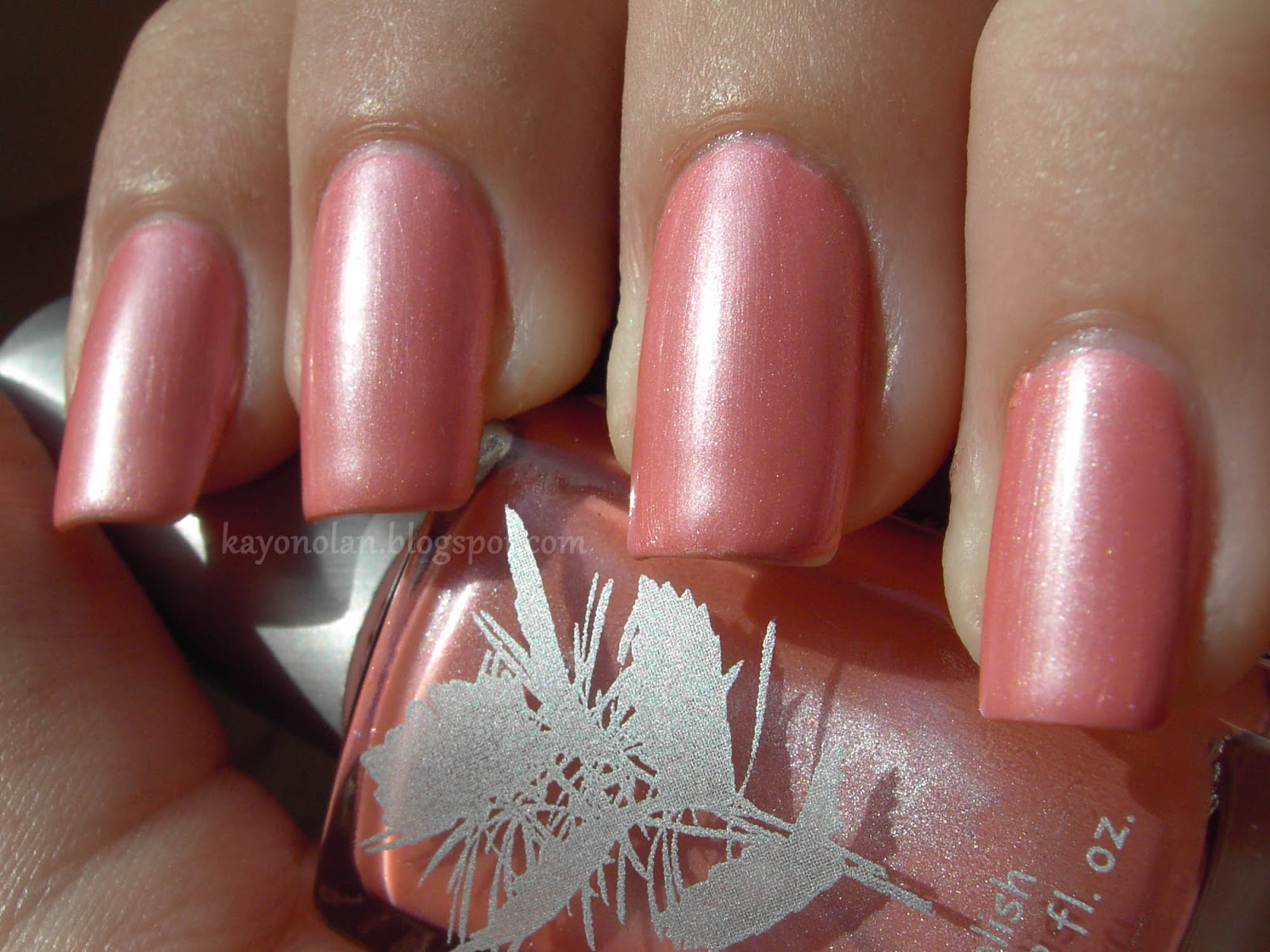
So anyway, I still have a lot of swatches in my 'ready' folder. Why not finally post one more of them? The following swatch of Susan Azalea by Priti NYC is no less than 18 months old. Honestly, after all this time, I can't really say much about it characteristics anymore, but I still kind of like the pictures. (My cuticles are so healthy-looking...)
Same as with French Affair by essie, I'm not a hundred percent sure if I can pull this kind of color of. I really like this kind of color though, so I'll probably wear them anyway.
Susan Azalea has this really pretty silver shimmer running through that makes it a bit special for me. The shimmer was one of the reasons why I bought it and I remember that I saw some swatches for this polish back in 2012 that didn't mention that shimmer... Really confused me, since it's one of the major characteristics, in my opinion.
Seeing the pictures makes me want to wear it again. It's the perfect season right now, but I would feel so bad... there's soooo many untrieds right in front of me. I really need to change my buying habits... °-°;
I wish Priti NYC weren't so expensive. I really like their formula and the colors are really pretty too. So whenever I see some at TKMaxx or the like, I'm grabbing some...
Do you like Priti NYC? Any colors to recommend?
Posts mit dem Label Priti NYC werden angezeigt. Alle Posts anzeigen
Freitag, 4. April 2014
Sonntag, 4. August 2013
The Nail Challenge Collaborative - Flowers - Week 4 - Kimono inspired
Hello!
I'm back with the final installment of my flowery manicures for The Nail Challenge Collaborative. I had nothing planned for this one actually and just did it last week. I decided on a design inspired by a kimono pattern... to celebrate the fact that my friend and I just booked ourselves a flight to Japan~ Sooo looking forward! It has been three years since I have been there and I miss it so much. So that's why. :D
Da bin ich wieder mit der letzten meiner blumigen Manis für die Nail Challenge Collaborative. Ich hatte dafür keine wirkliche Idee gehabt und sie auch erst letzte Woche getragen. Ich habe mich dann letztlich für dein Design entschieden, das an ein Kimono-Muster angelehnt ist. Dafür entschieden habe ich mich, weil ich mich grad so tierisch freue in 4 Wochen in Japan zu sein, denn meine Freundin und ich haben diese Woche kurzfristig entschieden, dass wir doch hinfliegen. Flug gebucht, nachher folgt die Planung der diesjährigen Reiseroute. Ich war seit 3 Jahren nicht dort und vermisse das Land sehr!
The base polishes for this were Priti NYC Bowles Black and OPI Meet me on the Star Ferry. The rest was painted with acrylic paints and enamel colors. Nothing fancy here, just praticing brushstrokes. I added a couple of rhinestones, studs and sequins on the non-flowery nails.
The pictures above were taken on day 2... when I had already lost one stud. But my Digicam didn't bleed out the golden accents like my android cam did on the pictures below taken on day 1.
Die verwendeten Lacke hier sind Priti NYC Bowles Black und OPI Meet me on the Star Ferry. Der Rest ist mit Acrylfarbe und Emailfarbe gemalt. Nichts besonderes dazuzusagen... ich habe mal wieder Pinselbewegungen geübt. Da hapert es leider immer noch sehr. Zum Schluss habe ich noch ein paar Glitzersteinchen und Nieten hinzugefügt.
Die Bilder oben habe ich am zweiten Tag mit meiner Digicam gemacht, weil mir aufgefallen war, dass die Android-Cam das Gold so rausgewaschen hatte, wie man unten erkennen kann. Leider hatte ich bis dahin schon eine Niete verloren.
That's it for the flowery manicures. The next theme is "Around the World", which might appeal to more ladies from the group than flowers. I'm looking forward to the many manis I'm going to see!
Das war's dann mit den Blumenmanis. Das nächste Thema ist "Rund um die Welt", was einigen Damen aus der Gruppe vielleicht mehr liegt als die Blumen. Ich freue mich jedenfalls auf die vielen Manis, die diesen Monat entstehen werden! :D
I'm off to visit my father now... feeling very weird with no nail polish on... *cough*
I'm back with the final installment of my flowery manicures for The Nail Challenge Collaborative. I had nothing planned for this one actually and just did it last week. I decided on a design inspired by a kimono pattern... to celebrate the fact that my friend and I just booked ourselves a flight to Japan~ Sooo looking forward! It has been three years since I have been there and I miss it so much. So that's why. :D
Da bin ich wieder mit der letzten meiner blumigen Manis für die Nail Challenge Collaborative. Ich hatte dafür keine wirkliche Idee gehabt und sie auch erst letzte Woche getragen. Ich habe mich dann letztlich für dein Design entschieden, das an ein Kimono-Muster angelehnt ist. Dafür entschieden habe ich mich, weil ich mich grad so tierisch freue in 4 Wochen in Japan zu sein, denn meine Freundin und ich haben diese Woche kurzfristig entschieden, dass wir doch hinfliegen. Flug gebucht, nachher folgt die Planung der diesjährigen Reiseroute. Ich war seit 3 Jahren nicht dort und vermisse das Land sehr!
The base polishes for this were Priti NYC Bowles Black and OPI Meet me on the Star Ferry. The rest was painted with acrylic paints and enamel colors. Nothing fancy here, just praticing brushstrokes. I added a couple of rhinestones, studs and sequins on the non-flowery nails.
The pictures above were taken on day 2... when I had already lost one stud. But my Digicam didn't bleed out the golden accents like my android cam did on the pictures below taken on day 1.
Die verwendeten Lacke hier sind Priti NYC Bowles Black und OPI Meet me on the Star Ferry. Der Rest ist mit Acrylfarbe und Emailfarbe gemalt. Nichts besonderes dazuzusagen... ich habe mal wieder Pinselbewegungen geübt. Da hapert es leider immer noch sehr. Zum Schluss habe ich noch ein paar Glitzersteinchen und Nieten hinzugefügt.
Die Bilder oben habe ich am zweiten Tag mit meiner Digicam gemacht, weil mir aufgefallen war, dass die Android-Cam das Gold so rausgewaschen hatte, wie man unten erkennen kann. Leider hatte ich bis dahin schon eine Niete verloren.
That's it for the flowery manicures. The next theme is "Around the World", which might appeal to more ladies from the group than flowers. I'm looking forward to the many manis I'm going to see!
Das war's dann mit den Blumenmanis. Das nächste Thema ist "Rund um die Welt", was einigen Damen aus der Gruppe vielleicht mehr liegt als die Blumen. Ich freue mich jedenfalls auf die vielen Manis, die diesen Monat entstehen werden! :D
I'm off to visit my father now... feeling very weird with no nail polish on... *cough*
Montag, 15. Juli 2013
The Nail Challenge Collaborative - Flowers - Week 1 - Dotticure
Hi everyone,
once again starting a bit late, but here's my first post for the Nail Challenge Collaborative's next theme: Flowers. That more my thing compared to neons, so I had/have quite a few ideas. For this first mani, I was inspired by camisole I own. The colors are a bit different, but it looks quite similar.
Ich fange mal wieder tierisch früh an, aber hier ist mein erster Beitrag zum Juli-Thema der Nail Challenge Collaborative: Blumen. Das ist viel mehr mein Ding als das leidige Neon-Thema. Darum habe/hatte ich dafür auch einiges an Ideen. Diese erste Mani ist inspiriert durch ein Trägershirt, das ich mein Eigen nenne. Die Farben sind ein bisschen anders, aber es sieht schon noch ähnlich aus.
I started with two coats of a bubblegum pink Color Club polish that has no label. Then, I grabbed my palette and put a couple of drops of
- essie Marshmallow
- a yellow Color Club
- priti NYC Queen of the Pink Hyacinth
- Manhattan 51K
- p2 love connection
and started dotting my flowers using a medium sized dotting tool. In the center of the flowers, I dabbed a little gold enamel, and on top of that, I added a tiny little bit of gold glitter. Lastly, I added one coat of essence BTGN Top Sealer.
Für diese Mani habe ich mit zwei Schichten eines unbenannten rosa Color Club-Lack begonnen. Dann habe ich mir meine Palette geschnappt und von den oben genannten Lacken jeweils ein paar Tropfen draufgegeben. Mit einem mittelgroßen Dotting Tool, habe ich dann meinen Blumenteppich gepunktet. In die Mitte der Blumen habe ich ein bisschen goldene Emailfarbe gegeben und darüber noch etwas goldenen Glitter. Beendet habe ich das Ganze mit einer Schicht BTGN Top Sealer.
It's another easy manicure, it's just a bit time consuming. I had to redo my thumb, because I messed it up with topcoat... I was really wowed by my own impatience. But I was quite pleased with the result. It was bright enough for summer, but still retained a spring feeling. And it made me wear perfume... I rarely do that. I thought that was kind of funny.
Auch das ist eine eher einfache Mani, die lediglich ein bisschen Zeit braucht. Ich musste meinen Daumennagel neu machen, weil ich ihn mit dem Topcoat verschmiert hatte... man, da war ich echt mal wieder begeistert von meiner Ungeduld. Alles in allem war ich mit dem Endergebnis aber recht zufrieden. Es war bunt genug für den Sommer, hatte aber irgendwie noch was frühlingshaftes. Und was ich lustig fand... ich habe in der Zeit, in der ich diese Mani trug, jeden Tag Parfum getragen - etwas das ich sonst nicht regelmäßig tue. :D
Anyway, thanks for reading! Please take a look at the pretty flower manicures of my fellow challengers too!
once again starting a bit late, but here's my first post for the Nail Challenge Collaborative's next theme: Flowers. That more my thing compared to neons, so I had/have quite a few ideas. For this first mani, I was inspired by camisole I own. The colors are a bit different, but it looks quite similar.
Ich fange mal wieder tierisch früh an, aber hier ist mein erster Beitrag zum Juli-Thema der Nail Challenge Collaborative: Blumen. Das ist viel mehr mein Ding als das leidige Neon-Thema. Darum habe/hatte ich dafür auch einiges an Ideen. Diese erste Mani ist inspiriert durch ein Trägershirt, das ich mein Eigen nenne. Die Farben sind ein bisschen anders, aber es sieht schon noch ähnlich aus.
I started with two coats of a bubblegum pink Color Club polish that has no label. Then, I grabbed my palette and put a couple of drops of
- essie Marshmallow
- a yellow Color Club
- priti NYC Queen of the Pink Hyacinth
- Manhattan 51K
- p2 love connection
and started dotting my flowers using a medium sized dotting tool. In the center of the flowers, I dabbed a little gold enamel, and on top of that, I added a tiny little bit of gold glitter. Lastly, I added one coat of essence BTGN Top Sealer.
Für diese Mani habe ich mit zwei Schichten eines unbenannten rosa Color Club-Lack begonnen. Dann habe ich mir meine Palette geschnappt und von den oben genannten Lacken jeweils ein paar Tropfen draufgegeben. Mit einem mittelgroßen Dotting Tool, habe ich dann meinen Blumenteppich gepunktet. In die Mitte der Blumen habe ich ein bisschen goldene Emailfarbe gegeben und darüber noch etwas goldenen Glitter. Beendet habe ich das Ganze mit einer Schicht BTGN Top Sealer.
![]() |
| Taken with my Android. It was sparkling~ |
Auch das ist eine eher einfache Mani, die lediglich ein bisschen Zeit braucht. Ich musste meinen Daumennagel neu machen, weil ich ihn mit dem Topcoat verschmiert hatte... man, da war ich echt mal wieder begeistert von meiner Ungeduld. Alles in allem war ich mit dem Endergebnis aber recht zufrieden. Es war bunt genug für den Sommer, hatte aber irgendwie noch was frühlingshaftes. Und was ich lustig fand... ich habe in der Zeit, in der ich diese Mani trug, jeden Tag Parfum getragen - etwas das ich sonst nicht regelmäßig tue. :D
Anyway, thanks for reading! Please take a look at the pretty flower manicures of my fellow challengers too!
Montag, 29. April 2013
Asian Dragon
I went a little crazy painting my nails this weekend. But it was fun. ^^
I wanted to paint an asian dragon over all my nails. That seemed okay, but while I was painting I realized, that right now my nails are either too small for this kind of painting, or I simply drew too big. Maybe a little of both.
For my dragon manicure, I mainly used
- A-England Dragon (noooo, not the reason I drew a dragon at all...) body
- Kiko 395 body
- Flormar SuperShine 07 body outline
- Priti NYC Queen Victoria back
- China Glaze Riveting details on the back
- OPI My vampire is buff background
Since I really battled with my hand while trying to take pictures, I decided to take seperate pictures as well and just put them together... My hand is not flexible enough. ;( Wow! to all those ladies who can bend their hand to take proper pictures like that...
I actually used polishes only (ok, except for the dragon's teeth)! I really like how the scales turned out. I ended up doing them differently from my plan, but it works. I just wish my nails were longer. I would have loved to paint more than one foot... and more~ tail.
So, what do you think of my excessive painting? Do you agree that a bit more space to paint on might have been good?
I'm going to upload my dragon to Kayla's indie polish contest. There are some really nice manis uploaded my close to 40 other nail artists. ^^
Ok, thanks for reading~ Tomorrow, I'll continue with my pastels.
I wanted to paint an asian dragon over all my nails. That seemed okay, but while I was painting I realized, that right now my nails are either too small for this kind of painting, or I simply drew too big. Maybe a little of both.
For my dragon manicure, I mainly used
- A-England Dragon (noooo, not the reason I drew a dragon at all...) body
- Kiko 395 body
- Flormar SuperShine 07 body outline
- Priti NYC Queen Victoria back
- China Glaze Riveting details on the back
- OPI My vampire is buff background
Since I really battled with my hand while trying to take pictures, I decided to take seperate pictures as well and just put them together... My hand is not flexible enough. ;( Wow! to all those ladies who can bend their hand to take proper pictures like that...
![]() |
| just the dragons body... |
![]() |
| in cloudy daylight |
I actually used polishes only (ok, except for the dragon's teeth)! I really like how the scales turned out. I ended up doing them differently from my plan, but it works. I just wish my nails were longer. I would have loved to paint more than one foot... and more~ tail.
So, what do you think of my excessive painting? Do you agree that a bit more space to paint on might have been good?
I'm going to upload my dragon to Kayla's indie polish contest. There are some really nice manis uploaded my close to 40 other nail artists. ^^
Ok, thanks for reading~ Tomorrow, I'll continue with my pastels.
Freitag, 5. April 2013
Let it Snow! Challenge 11: Valentine's Day
Hallo zusammen!
About two months late, I'd like to show you my Valentine's nails. Valentine's Day was theme 11 from the Let it Snow! Challenge. I still had some ideas from last year's brainstorming, but I ended up being inspired by another nail artist.
Compared to the original, I changed colors to a couple of untrieds in the purple range. It still works with the silver. I sponged the gradient (yes, another gradient) on top of two coats of white polish. It took two layers of sponging though, because some of the polishes turned out to be quite sheer. The hearts were painted with a dotting tool, because I was too lazy for a brush.
At first, I was kind of worried if those colors make my nails look frozen. But I think it's fine... I got to use my first essie, French Affair, again. I wonder why I always end up using this polish for Valentine's nails..? :D
Thanks for reading!
About two months late, I'd like to show you my Valentine's nails. Valentine's Day was theme 11 from the Let it Snow! Challenge. I still had some ideas from last year's brainstorming, but I ended up being inspired by another nail artist.
Compared to the original, I changed colors to a couple of untrieds in the purple range. It still works with the silver. I sponged the gradient (yes, another gradient) on top of two coats of white polish. It took two layers of sponging though, because some of the polishes turned out to be quite sheer. The hearts were painted with a dotting tool, because I was too lazy for a brush.
At first, I was kind of worried if those colors make my nails look frozen. But I think it's fine... I got to use my first essie, French Affair, again. I wonder why I always end up using this polish for Valentine's nails..? :D
Thanks for reading!
Donnerstag, 22. November 2012
Priti NYC - Queen of the Pink Hyacinth (Swatch)
It's time for another swatch post! Today, I'd like to show you a couple of pictures of yet another Priti NYC polish. In my opinion, a very interesting polish. I bought it in a set at TK Maxx a while ago and I didn't think I'd like it as much as I do. But the finish changed that. Please take a look at Priti NYC Queen of the Pink Hyacinth, a light pink with strong coral undertones and silver shimmer.
From the bottle, I thought this one would have a frost finish and that's not really my favorite kind of finish. But it translates differently on the nail. Due to the shimmer, there are some visible brushstrokes, but they are not very noticeable. What I loved the most is how this polish looks depending on the light! This polish dries rather glossy, but depending on the light, it looks as if it has a velvet finish. In other light, the silver shimmer takes over and it does look frosty... But since it doesn't show many brushstrokes, I'm totally fine with that!
This was probably the most surprising shade from the set I bought. I like the finish, the color and that it actually looks quite nice with my skintone. Corals aren't easy for me to wear. But I like this one. Formula-wise I can't complain. Most Priti NYC polishes have a very nice formula and apply smoothly. I don't remember whether it dried quickly or slowly, but I judging from me not smudging it... not bad.
Do you like shades like Queen of the Pink Hyacinth?
From the bottle, I thought this one would have a frost finish and that's not really my favorite kind of finish. But it translates differently on the nail. Due to the shimmer, there are some visible brushstrokes, but they are not very noticeable. What I loved the most is how this polish looks depending on the light! This polish dries rather glossy, but depending on the light, it looks as if it has a velvet finish. In other light, the silver shimmer takes over and it does look frosty... But since it doesn't show many brushstrokes, I'm totally fine with that!
This was probably the most surprising shade from the set I bought. I like the finish, the color and that it actually looks quite nice with my skintone. Corals aren't easy for me to wear. But I like this one. Formula-wise I can't complain. Most Priti NYC polishes have a very nice formula and apply smoothly. I don't remember whether it dried quickly or slowly, but I judging from me not smudging it... not bad.
Do you like shades like Queen of the Pink Hyacinth?
Donnerstag, 15. November 2012
Priti NYC - Oleaster (Swatch)
Today, I finally want to post my swatch pictures of Priti NYC Oleaster. I have already used this in two manicures. One of them was the Cloudy Days mani from the Fall into Autumn Challenge. I wasn't sure if I like this color at first. It's muddy, grey and not very pleasant looking. But well, it wasn't even true fall yet, when I bought it. Right now, this kind of color is everywhere when I look out of the window.
Priti NYC Oleaster is a grey with subtle green undertones that dries to a semi-matte finish. I played a bit with this polish while swatching. On two coats of Oleaster, I applied a matte topcoat on my index and normal glossy topcoat on my ringfinger. As you can see, the original finish of Oleaster is somewhere inbetween.
The matte topcoat makes it more greyish, the glossy topcoat a bit more green, in my opinion. I prefer Oleaster's own finish. It looks the most interesting to me. Mattified, I find it a bit too dull and with glossy topcoat, the shade is nothing special anymore. I'm not even sure I like it with my skintone. But I do when it's just left alone. Weird, hm?
Application and drying time are nice. I didn't know Oleaster was a semi-matte polish when I bought it, so drying time might have been a little faster than anticipated.:D
What do you think of this polish? Would you have bought it?
Priti NYC Oleaster is a grey with subtle green undertones that dries to a semi-matte finish. I played a bit with this polish while swatching. On two coats of Oleaster, I applied a matte topcoat on my index and normal glossy topcoat on my ringfinger. As you can see, the original finish of Oleaster is somewhere inbetween.
The matte topcoat makes it more greyish, the glossy topcoat a bit more green, in my opinion. I prefer Oleaster's own finish. It looks the most interesting to me. Mattified, I find it a bit too dull and with glossy topcoat, the shade is nothing special anymore. I'm not even sure I like it with my skintone. But I do when it's just left alone. Weird, hm?
Application and drying time are nice. I didn't know Oleaster was a semi-matte polish when I bought it, so drying time might have been a little faster than anticipated.:D
![]() |
| indoors |
What do you think of this polish? Would you have bought it?
Montag, 1. Oktober 2012
Priti NYC - Fire Carpet (Swatch)
Until I have looked through the pictures for the nail art I did last night, I'd like to show a couple of pictures of another Priti NYC polish. Just like Bowles Black, I bought it a while ago with a few other shades. It's called Fire Carpet. At first, I didn't like it very much and had thoughts about selling it after I swatched it, but when I was done doing that, I found myself quite fond of this shade. It's nothing unseen, but at least when I did a quick search, I didn't find something too similar in my stash.
Fire Carpet is a light red jelly that leans a little pink and is infused with pink shimmer that gives it that pink glow. It's a tad brighter than it looks on my pictures, but it's far from a neon.
Fire Carpet doesn't go perfectly with my skintone, but it's a nice one. It's one of those polishes I'll only use on its own, I guess. I get this feeling that it would be very boring otherwise. ;)
Okay, I'm not very good a describing colors... so I'll stop here and let you have your own thoughts about it~
See you soon!
Fire Carpet is a light red jelly that leans a little pink and is infused with pink shimmer that gives it that pink glow. It's a tad brighter than it looks on my pictures, but it's far from a neon.
Fire Carpet doesn't go perfectly with my skintone, but it's a nice one. It's one of those polishes I'll only use on its own, I guess. I get this feeling that it would be very boring otherwise. ;)
Okay, I'm not very good a describing colors... so I'll stop here and let you have your own thoughts about it~
See you soon!
Samstag, 22. September 2012
Fall into Autumn 4: Cloudy Days
Aaaah, I'm so behind with my nail art this week... I was told last weekend that I have to move to another room in the house by the end of next week. Since I'm not going to be around much next week because of a seminar I'm attending, all the moving stuff has to happen before that. So instead of painting my nails, I was painting walls the last couple of days. I hurt so much every night... I didn't feel like painting my nails at all. But the bright side of the story: The "Kellerkind" (it's an idiom here in Germany basically meaning something like nerd, but if you take it literally means child living in the basement) is going to be an "Attic Cat" starting next week. Btw, has anyone seen this K-Drama?
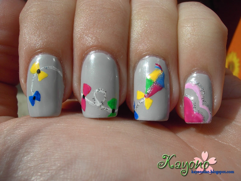
But today, I want to present my cloudy day nails. They are not exactly cloudy, but when I was thinking what I could paint for the theme, I recollected my childhood and how we would fly kites in autumn when it was windy enough. And well, those days often were cloudy days.
I used Manhattan Lotus Effect 16 as my base color and used white acrylic paint to pre-paint the kite and cloud shapes. For the kite I used an unnamed yellow Color Club, Kiko 386, BeYu 393 and a couple of other acrylic paints. The clouds were painted using my favorite unnamed white Color Club, Priti NYC Oleaster, the already mentioned BeYu polish and pink acrylic paint.
I really like how the clouds on my thumb look. I might do that color combo again.
But what do you think? Did you fly kites too?
But today, I want to present my cloudy day nails. They are not exactly cloudy, but when I was thinking what I could paint for the theme, I recollected my childhood and how we would fly kites in autumn when it was windy enough. And well, those days often were cloudy days.
I used Manhattan Lotus Effect 16 as my base color and used white acrylic paint to pre-paint the kite and cloud shapes. For the kite I used an unnamed yellow Color Club, Kiko 386, BeYu 393 and a couple of other acrylic paints. The clouds were painted using my favorite unnamed white Color Club, Priti NYC Oleaster, the already mentioned BeYu polish and pink acrylic paint.
But what do you think? Did you fly kites too?
Montag, 17. September 2012
LDTTWC Day 3 - I remember when...
For the third day of the Time Warp Challenge, we are supposed to create a manicure in honor of an event in history... either well-known or personal. At first, I wasn't sure what to do for this one. There aren't many memories that I could do a manicure on and I had no idea what well-known event I should choose. In the end, swatching my newest Priti NYC polishes gave me the answer.
After swatching Priti NYC Bowles Black, I decided to do a manicure in honor of the first men on our moon on July 21st 1969. It's not something I remember, but it's a very well-known event.
I love how the flakies in Bowles Black show up quite well on my thumbnail in this picture. It's like a million tiny glitter stars plus a few weird looking acrylic color ones. I painted those nails so that they look right for me... and because I thought that using the half moons of my nails as the moon's shape provides a nice coherent frame.
So besides using Priti NYC Bowles Black, the black polish, I also used Barielle Sterling Silver. I applied it on top of Bowles Black as my moon's color. On my middle and pinky nails, I also sponged on some essence rich&pretty as well as grey denim and a mixture of those plus Bowles Black. My egg-shaped planet Earth was painted using my new all-time white, an unnamed Color Club, and Kiko 386.
My astronaut and the foot print were painted using black and white acrylic paint.
I was really happy with these nails. It took a while to paint, but it was worth it! They didn't make it to the end of the day though, because I was too lazy to paint my other hand with pretty moon things too... I just should have painted them, because half of the polish I applied instead came off while I was asleep. Haven't had that in a while. ^^;
What do you think of my moonwalk nails?
After swatching Priti NYC Bowles Black, I decided to do a manicure in honor of the first men on our moon on July 21st 1969. It's not something I remember, but it's a very well-known event.
I love how the flakies in Bowles Black show up quite well on my thumbnail in this picture. It's like a million tiny glitter stars plus a few weird looking acrylic color ones. I painted those nails so that they look right for me... and because I thought that using the half moons of my nails as the moon's shape provides a nice coherent frame.
So besides using Priti NYC Bowles Black, the black polish, I also used Barielle Sterling Silver. I applied it on top of Bowles Black as my moon's color. On my middle and pinky nails, I also sponged on some essence rich&pretty as well as grey denim and a mixture of those plus Bowles Black. My egg-shaped planet Earth was painted using my new all-time white, an unnamed Color Club, and Kiko 386.
My astronaut and the foot print were painted using black and white acrylic paint.
I was really happy with these nails. It took a while to paint, but it was worth it! They didn't make it to the end of the day though, because I was too lazy to paint my other hand with pretty moon things too... I just should have painted them, because half of the polish I applied instead came off while I was asleep. Haven't had that in a while. ^^;
What do you think of my moonwalk nails?
Priti NYC - Bowles Black (Swatch)
I bought myself a couple of new Priti NYC polishes last week, when I found this set of 5 for little money at my local TK Maxx. It had a couple interesting colors in there and because I usually like their formula, I took it home with me.
One of the colors in this Priti NYC set is Bowles Black, a black polish infused with tiny silver flakies. At first I thought it's glitter, but when I was applying it, I noticed that the glitter was irregular and there were a couple slightly bigger pieces. Works with me. Flakies are easier to remove anyway.
I used this polish as my base for the nail art I'm going to show you later tonight. Since the weather was so nice yesterday and this was a new polish for me, I decided to take a couple pictures for a swatch post. My pictures show three coats. You could get away with two if you apply slightly thicker coats, but this polish tends to be a little runny, so thin coats worked better for me.
Bowles Black falls in the same category as MNY 673, I have posted about in February. This one, too, is a black base filled with silver flakies. They are similar, but yet so different. The flakies in the MNY are a lot bigger than the ones in Priti NYC. But the silver flakies don't show up better in the Priti NYC as in the MNY. The Priti NYC doesn't need a topcoat to make the flakies show up in the first place though. Bowles Black is very glossy on its own. The formula is similar, but the drying time was definitely better for the Priti NYC.
All in all, I think Bowles Black looks a bit more sophisticated than 673. Same as with the MNY, I think the flakies give this black polish a softer, more wearable look, but since the flakies are smaller it makes the look more homogeneous. I still like the MNY! But I wouldn't have used that one as my base for the nail art coming next. :D
What do you think? Do you own any of the two or maybe another polish falling in this category? What are your thoughts about it then?
One of the colors in this Priti NYC set is Bowles Black, a black polish infused with tiny silver flakies. At first I thought it's glitter, but when I was applying it, I noticed that the glitter was irregular and there were a couple slightly bigger pieces. Works with me. Flakies are easier to remove anyway.
I used this polish as my base for the nail art I'm going to show you later tonight. Since the weather was so nice yesterday and this was a new polish for me, I decided to take a couple pictures for a swatch post. My pictures show three coats. You could get away with two if you apply slightly thicker coats, but this polish tends to be a little runny, so thin coats worked better for me.
Bowles Black falls in the same category as MNY 673, I have posted about in February. This one, too, is a black base filled with silver flakies. They are similar, but yet so different. The flakies in the MNY are a lot bigger than the ones in Priti NYC. But the silver flakies don't show up better in the Priti NYC as in the MNY. The Priti NYC doesn't need a topcoat to make the flakies show up in the first place though. Bowles Black is very glossy on its own. The formula is similar, but the drying time was definitely better for the Priti NYC.
All in all, I think Bowles Black looks a bit more sophisticated than 673. Same as with the MNY, I think the flakies give this black polish a softer, more wearable look, but since the flakies are smaller it makes the look more homogeneous. I still like the MNY! But I wouldn't have used that one as my base for the nail art coming next. :D
What do you think? Do you own any of the two or maybe another polish falling in this category? What are your thoughts about it then?
Mittwoch, 4. Juli 2012
Priti NYC - Queen Victoria (Swatch)
Hi everyone~
I hope everyone is doing great today! I know it's a special day for a lot of people overseas, so I hope you're having fun today!
Well, no america-themed mani from me, but I'd love to show you a polish I bought a while ago, when the brand was on sale at Zalando. The brand is usually a bit too pricy for my taste, but should it be on sale again I'd definitely consider buying a few more shades. My experience with Priti NYC has been quite good so far.
The polish I want to show you is called Queen Victoria and as far as I know it's from their core line of polishes. The brand is doing so many limited editions, it's kind of hard to track them all ^^;
Queen Victoria is a gorgeous red jelly polish packed with pink and gold micro glitter. It looks very juicy! When I first wore this polish, it wasn't exactly the time for strawberries yet, but it made me crave some. Doesn't it look like fresh made strawberry jam!?
This is two coats and it could have used a third to erase every last trace of visible nail line. I'm not *that* picky about a hint of visible nail line though. The first coat goes on a bit streaky and very pink tinted, but with the second coat it's definitely red.
I got a lot of compliments when I wore Queen Victoria. I didn't even do any nail art, but people still kept commenting. I rarely wear red, but this one is awesome. It might even be my favorite red. I'm wearing it on my toes right now~ It's definitely an eyecatcher!
Drying time is nothing special, not very fast, but not exactly slow either. It dries very glossy, but I love the extra shine my beloved essence BTGN Top Sealer adds, so one coat of that.
Lastly, a bottle shot to show you the micro glitter suspended in the red jelly base.
I love this polish... I'm so glad I got it, even though it took me forever to finally wear it.
On a sidenote... I really like my nails on these pictures. I'm sad right now. Two of my left hand nails broke yesterday and I'm back to total nubbins. I don't remember when my nails where so short that there's no visible nail line... must have been ages ago. I hate the look. ;-(
Grow, nails, grow! Faster!
I hope everyone is doing great today! I know it's a special day for a lot of people overseas, so I hope you're having fun today!
Well, no america-themed mani from me, but I'd love to show you a polish I bought a while ago, when the brand was on sale at Zalando. The brand is usually a bit too pricy for my taste, but should it be on sale again I'd definitely consider buying a few more shades. My experience with Priti NYC has been quite good so far.
The polish I want to show you is called Queen Victoria and as far as I know it's from their core line of polishes. The brand is doing so many limited editions, it's kind of hard to track them all ^^;
Queen Victoria is a gorgeous red jelly polish packed with pink and gold micro glitter. It looks very juicy! When I first wore this polish, it wasn't exactly the time for strawberries yet, but it made me crave some. Doesn't it look like fresh made strawberry jam!?
This is two coats and it could have used a third to erase every last trace of visible nail line. I'm not *that* picky about a hint of visible nail line though. The first coat goes on a bit streaky and very pink tinted, but with the second coat it's definitely red.
Drying time is nothing special, not very fast, but not exactly slow either. It dries very glossy, but I love the extra shine my beloved essence BTGN Top Sealer adds, so one coat of that.
Lastly, a bottle shot to show you the micro glitter suspended in the red jelly base.
I love this polish... I'm so glad I got it, even though it took me forever to finally wear it.
On a sidenote... I really like my nails on these pictures. I'm sad right now. Two of my left hand nails broke yesterday and I'm back to total nubbins. I don't remember when my nails where so short that there's no visible nail line... must have been ages ago. I hate the look. ;-(
Grow, nails, grow! Faster!
Donnerstag, 9. Februar 2012
Priti NYC - dazzler
Today, I want to show you my very first Priti NYC polish. So far I have rarely seen Priti NYC on blogs, but I think the shades this company has to offer are quite nice. For those of you who don't know Priti NYC, this is what they say about themselves:
Peace, Love & Satisfaction... Priti has many meanings in Sanskirt such as any pleasurable sensation, with love, out of satisfaction, affection, attraction, and happy. Women everywhere can now help keep our planet Priti- and look good while doing so...
Priti NYC is an organic skincare line that specializes in hand and feet products. Part of their products is a quite nice assortment of nail polish, that is cruelty-free and doesn't contain Formaldehyde, Toluene and DBP.
Well, I have seen their products on various online shops, but the price was a bit high for my budget, so I never considered buying one. Right now, they are on sale at Zalando though, so I ordered myself a few, okay, 20. Zalando offers free shipping and returning, that's why I ordered so many. I kept only 4 of them. I would have kept more, but I limited myself to only 4.
Out of the 20 I ordered, the shade I want to show you today was the first I decided to keep. Honestly, there was not much deciding in this case. I saw it in the package and knew I would keep it. This particular shade is called dazzler. Fitting name, in my opinion. It did dazzle me into keeping it after all.
See the shimmer in the bottle? My pictures couldn't quite capture it, but it does translate to the nail. It looked so beautiful!
Priti NYC dazzler applies smoothly and dries quite fast. This is two coats plus topcoat, although it doesn't need the topcoat. I applied it to make my manicure last a day longer. The polish itself has a nice finish on its own. The brush is nice too. I'll take pictures of it when I wear the other 3 shades.
For me dazzler is actually an unusual shade, but lately, I'm slowly coming to like reds. This is no real red, more of a very reddish toned burnt orange. I don't have a shade like this in my collection yet, but I searched the internet for a few pictures of polishes that might be similar. I came across Color Club Feel the Beat. There's one in the essence color & go line that is similar, but doesn't have the pretty shimmer, that made this color so appealing to me...
This won't be the last Priti NYC shades I'll buy. The formula is nice and there are a few shades that I ordered and sent back, that still appeal to me. Plus, I saw some really nice swatches lately that made me want more of them.
If you haven't tried this brand yet, do it. From what I have heard, their former formula was bad, but they did a makeover and their current formula is just as nice as our other beloved brands'.
Abonnieren
Posts (Atom)